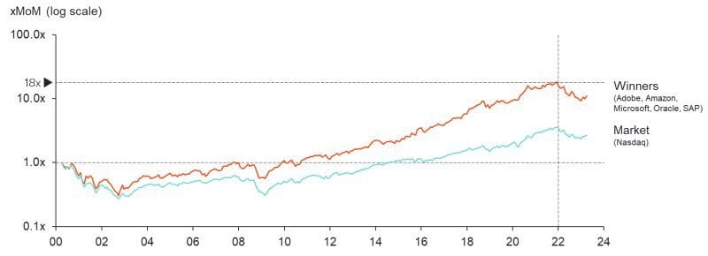
If you had invested at the peak of the market in 2000 it would have taken you ~15 years to get your money back.

The first time I saw a similar chart, in my early Private Equity days at Permira, it was a lightbulb moment…it is also why I’ve tried to remain as disciplined as possible in 2020/2021.
Let’s deep dive in the chart.
First let’s define terms: by winners I mean Adobe, Amazon, Microsoft, Oracle and SAP ; market is Nasdaq. For the purist out there, I’ve kept the analysis simple looking at close price (and yes I know SAP is not on the Nasdaq but I wanted to have a European co in the pool).
⌛It would have taken only 7 years to get back to 1x if you had picked the winners vs. 15 years with the Nasdaq
📉 At the ‘02 trough your portfolio would be down 70% in line with the market but in ‘08 you would have been at -30% vs. -70%
📊 End of ‘21 your returns would be 18.1x vs. 3.5x and today 11.0x vs. 2.7x
Take the long-term view
(p.s. out of the winners, can you guess which one drives the higher MoM?)